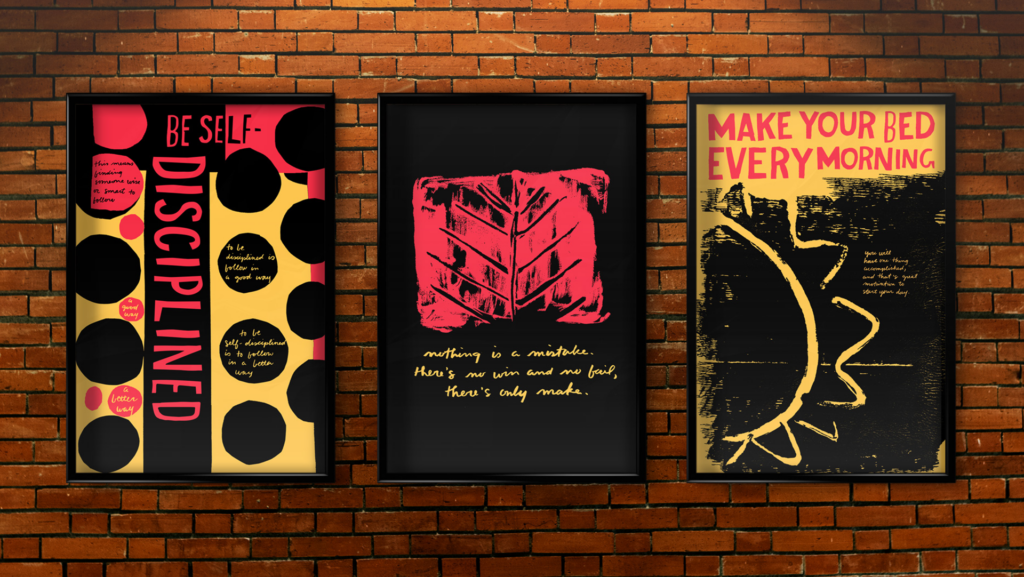
PIECES OF ADVICE POSTER SERIES
Three quotes of advice were chosen from Corita Kent and designed three different ways using inspiration from her work. The process was to mimic the original design and change one thing, then practice her process, and then combine the two. Methods used are monoprinting, cut paper, and handwritten type. The colors of gold, bright red, and black were inspired by Kent’s A Breath of Fresh Air, which was from A Set of Heroes and Sheroes.


The negative space that creates the sun and the texture produced from the monoprint both work together to bring visual interest and movement. Just as Kent uses cut paper and hand-written script in her prints in random places, the cut paper is used for the title at the top, and the hand-written type is used in the explanation for why it’s a good idea to make your bed every morning.
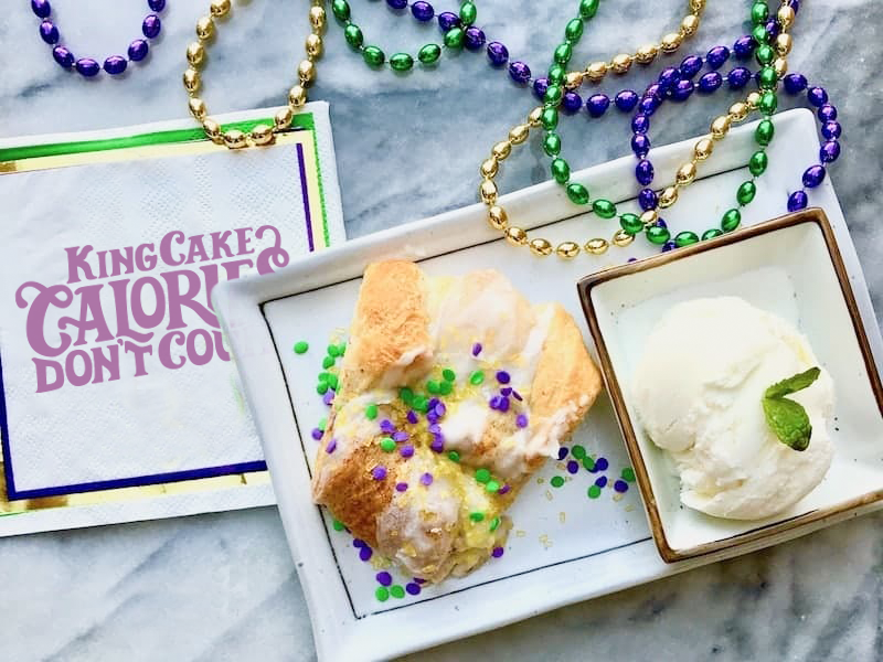
LOUISIANA KING CAKE FESTIVAL SWAG DESIGN
The handmade type design was inspired by combining a serif and sans serif type styles from the Victorian time period to create a recipe for a new style of lettering. Hierarchy is given to the most important aspect of the design—“Calories” don’t count. The readability was solved by forming the bottom arm of the “E” with the leg of the “R.”


MODULAR FONT DESIGN
This type style is created by studying and selecting a type from the Victorian time period to transform into a modular font using grids. The challenge was to create the font using the least amount of modules possible in order to form each letter and number. Fontself was used to create a working font.


SAME SHAPE,
DIFFERENT MEANING
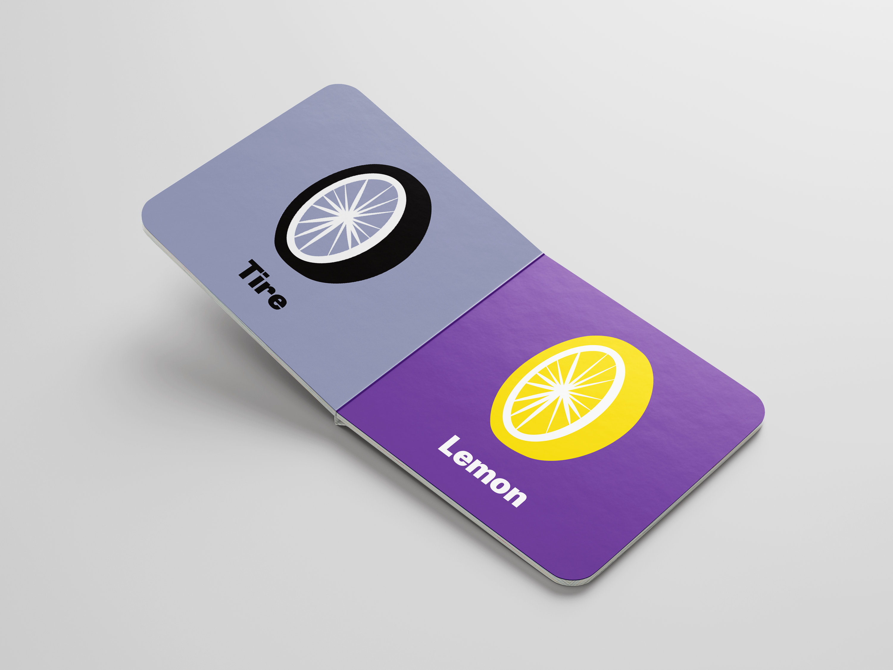
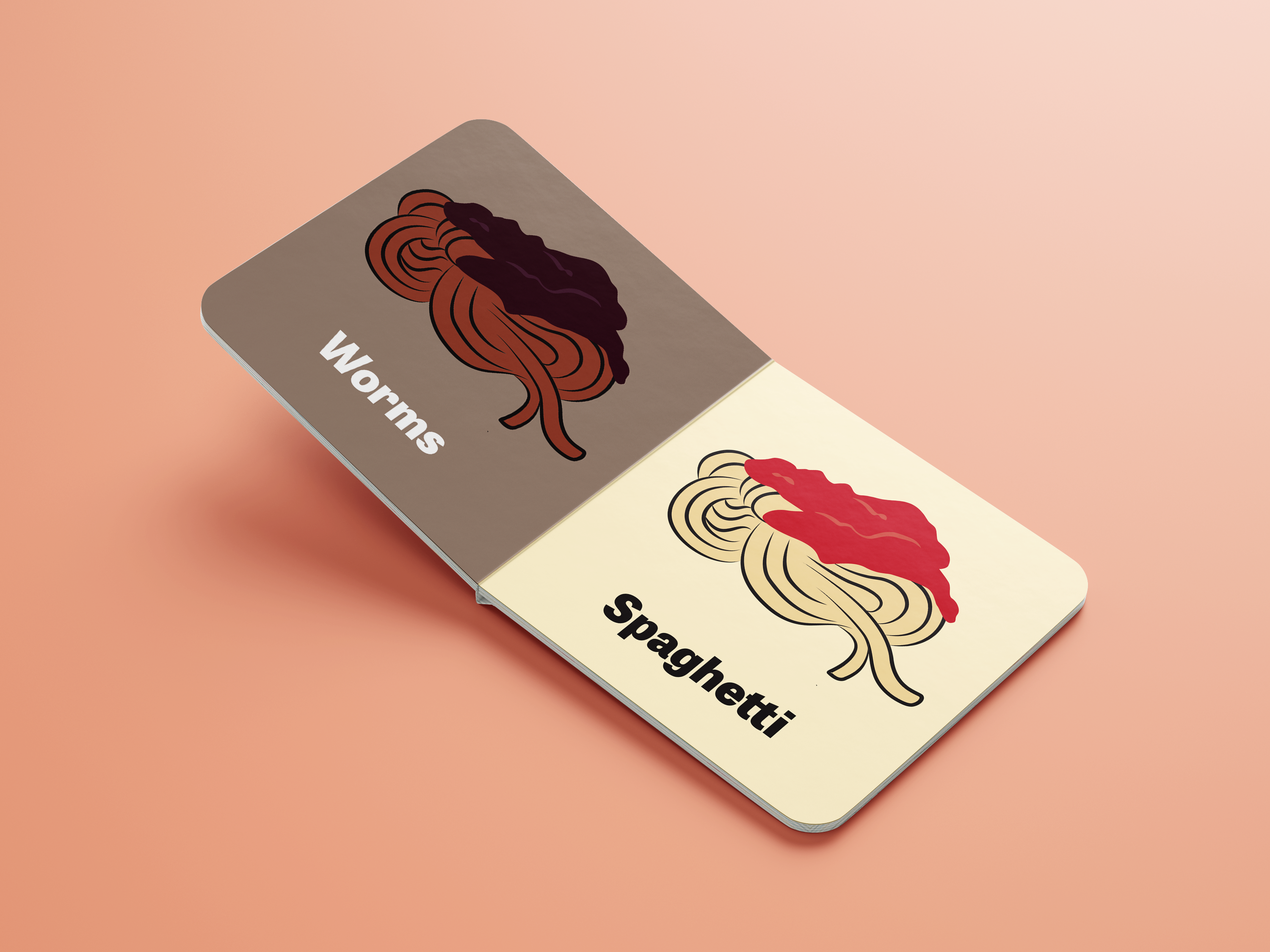
BOARD BOOK DESIGN
The design challenge creates two exact compositions with the same exact shapes. By only changing the color, it changes the meaning. Similar lines are used throughout to create a cohesive system. A pattern is created from the circles on the microphone and snowcone to be used on the moon and orange, as well as the book cover, tying everything together.


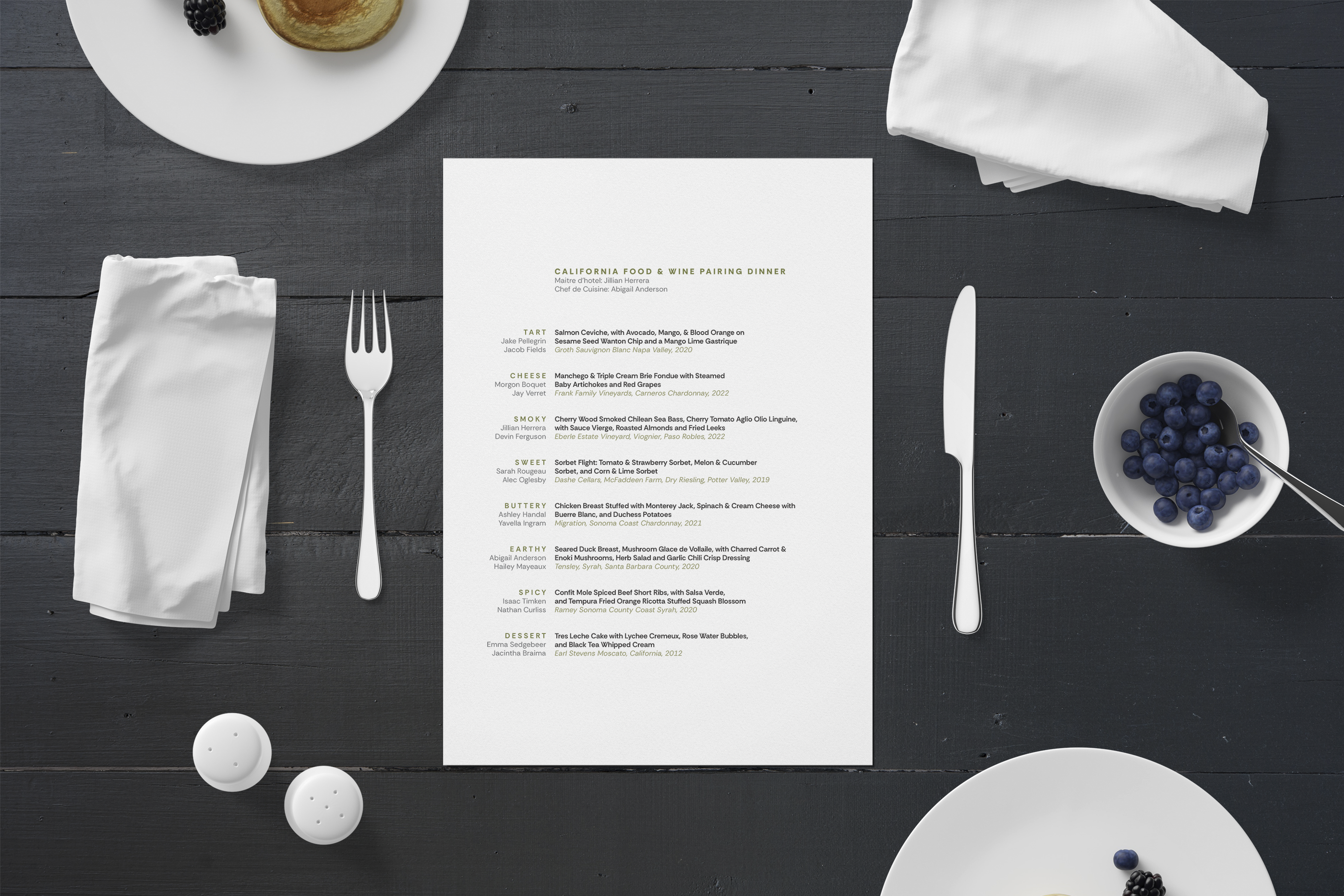
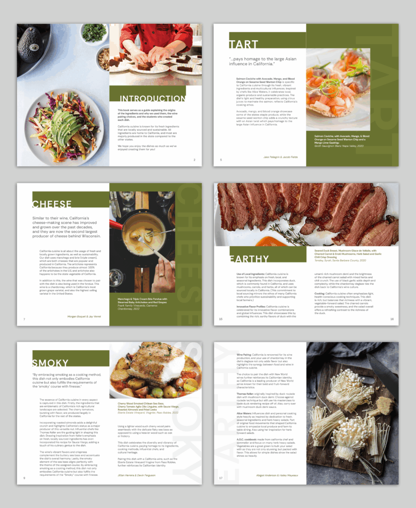
CULINARY COLLABORATION: MENU AND PRESENTATION SYSTEM
This project is in collaboration with the Chef John Folse Culinary Institute to deliver a system that included a one-page menu, a dinner companion booklet, presentation template, and name cards for the Senior Wine Paring Class Dinner. The solution provides the culinary students with the ability to edit the system in Microsoft Office and print at their convenience.


ICON DESIGN
The fresh produce icons were created using a grid structure. Thick and thin lines were used throughout, and geometric shapes were incorporated to each icon to keep the icons related to one another. Each produce icon can be used with the identity system that was created for a fresh produce delivery service called Produce Hope, which “produces hope” for at-risk teens. The icons are used on merchandise that helps spread the word about the business and provides another stream of income when fresh produce may not be readily available. The icons are also used as symbols on the monthly menu and mobile app.
IDENTITY SYSTEM FOR A NON-PROFIT
Friends of Bayou Lafourche is a non-profit entity that works directly with Bayou Lafourche Fresh Water District (BLFWD). This system was designed to compliment BLFWD by using elements of the bayou, such as elephant ears and a water graphic. The modified sans serif typeface shows the friendly aspect of the company and is stacked to create stability in the design.

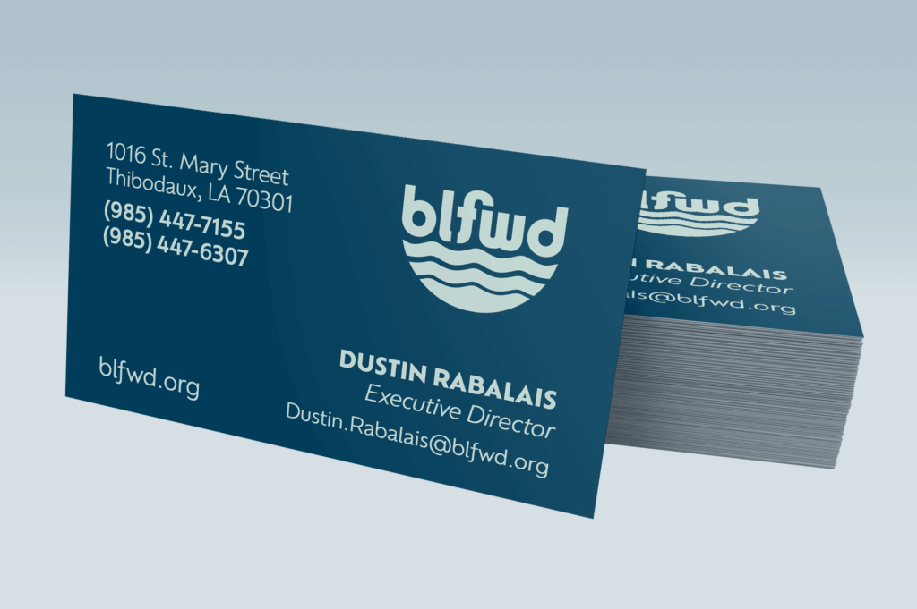
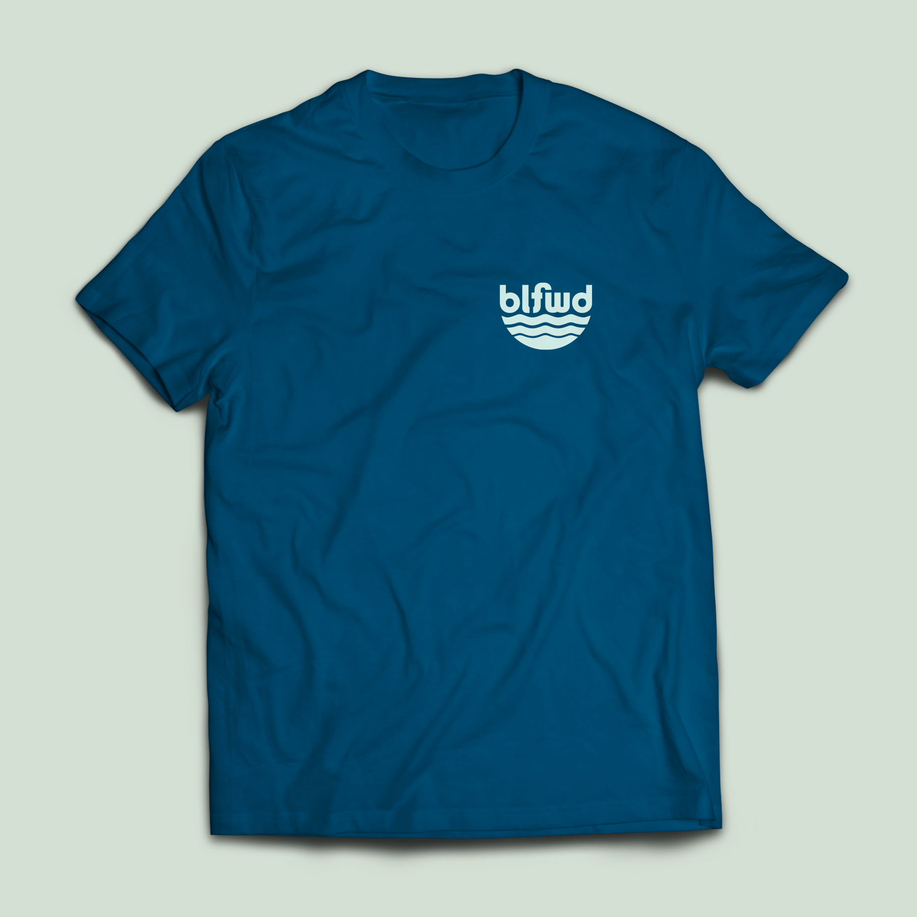
IDENTITY SYSTEM: BAYOU LAFOURCHE FRESH WATER DISTRICT
This new identity system for Bayou Lafourche Fresh Water District encompasses the elements of the bayou while representing the importance of the company and the established purpose of their work. The bold type is designed so that the letters flow into one another and sits on top of the graphic water design to represent the flow of the bayou, which is the ultimate goal of the company. The circular shape allows the design to be contained within a circle for ease of use on social media, vehicles, stickers, t-shirts, and other printed and digital media.